


 this was tasty. would love to have a cool sculpture like this on my wall. what do you have on your wall right now?
 i know alot of people don't like ice, but i think it's absolutely beautiful and a blast to drive in. it's the only time i get to try and drift my element. all wheel drive is a joy in times like these.
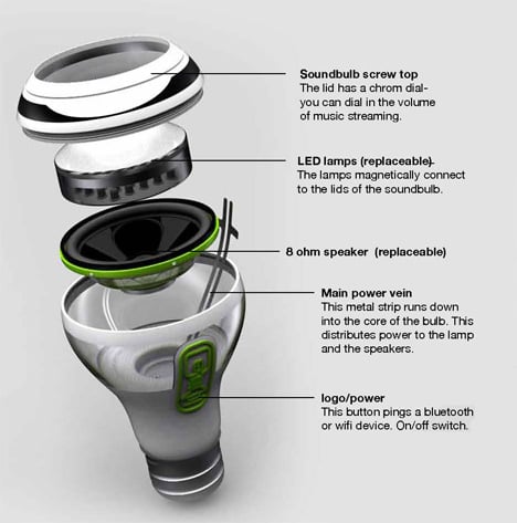 i stumbled upon this concept lightbulb this afternoon. i would totally get a couple of these if they were actually in production. it would be great to have wireless music come out of my light bulbs. hah! the question is, do the lights have to be on in order to listen to music? and how does this work with lights with dimmers? interesting concept.
 finally got my tshirt in from spreadshirt. the print came out really nice. i'm very happy with the digital print transfer. not sure what the status is on my track jacket. hopefully that should come in sometime soon (considering that it's freezing outside). simple shirt. what do you think?
here's my original post.


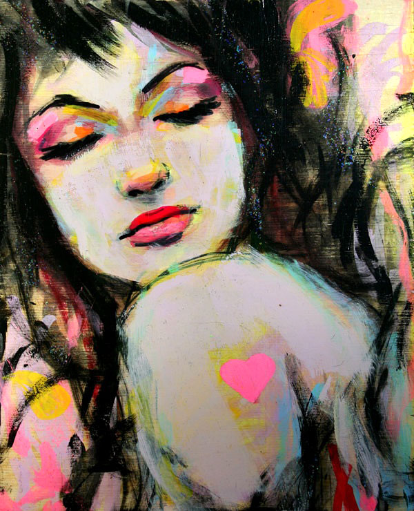
 at last this painting is finished. i just photoshopped frame around it to see what it could look like. ^__^ what do you think? here's where it started.
 not many albums have moved me as much as this one. there are a couple songs that shouldn't be on the double disk, but i felt that the overall concept was on of their strongest. this is one of my fav songs off fragile, and so i created a little video a few years ago.
the images were edited from a vhs tape i got when i was a 10yrs old, called "death trap". it was one of my favorite documentaries about carnivorous plants. anyway, just thought i'd share. haven't shown it to many people.
nin video from Jeffrey Wong on Vimeo.

 very nice poster/logo. i came across this recently. i think the treatment could be a little more simple. there are almost too many colors to process. they could have gotten the point across with 3 colors instead.
i'm not a big fan of futura, but i love the way it's used in this layout. the 200pt kerning makes it very delicate and elegant.
i found this on fffound.com. it's a really nice source for design inspiration.


 just started a new series of carnivorous plants. i'm really happy with this sketch direction. i like the vibrant colors. i'm looking forward to experimenting with more in this direction. there's a good chance i'll blow this one up to a larger scale. maybe i'll paint over the "red hair" canvas. what do you think?
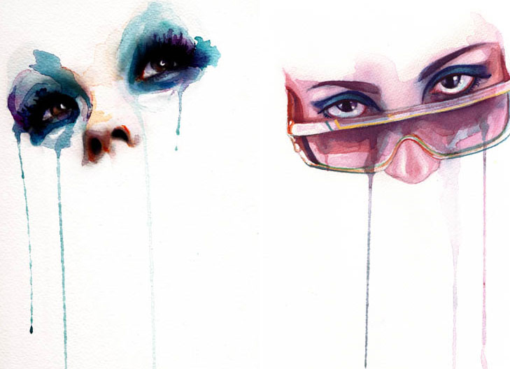
 this is part of the blonde series i was working on. it's just a sketch. not sure if it's something i'm going to blow up larger. the good news is that the little paintings are easy to knock out... and it's no big deal if i mess up.
 this used to be yellow, but i changed it to red. interesting concept, but it lacks vibrancy and energy. i'm debating whether to paint over this and start over with something entirely different. does it suck?
my hypothesis is that it's become part of popular culture to hate it. i went to a design conference and the speaker asked the audience what the ugliest font in the world was—everyone quickly vocalized "comic sans" and laughed. honestly, i think there are more hideous typefaces (that are harder to read, overused, and abused by designers) than comic sans.
most people don't even know why it's called "comic sans". well, if you know anything about typography, "sans" means "without". really, the formal typeface should be called "comic sans serif", which means "without serif". examples of serif typefaces would be times, georgia, palatino. examples of san serif typefaces would be arial, helvetica, univers.
comic sans was actually designed by a typographer that simplified comic (the serif version). the san serif version of comic was designed to imitate handwriting for a comic book. the designer actually created several other typefaces that were in a handwritten style... appropriate for children's books and of course, comics. the problem was that comic sans was a stock font in windows and was used to create signage, posters, and eventually made its way into logos. there's even a website that's called ban comic sans.
so if you really hate comic sans, why? if you don't know, perhaps ask yourself if you're just following a trend. yes, comic sans is not a respectable typeface... but then again, have you ever created a typeface? its actually much more challenging than you think. typography is extremely complex. To craft an alphabet, let alone numbers, symbols, kerning, and understanding typographic algorithms is quite a nightmare.
yes, this shirt will be a conversation starter b/c it's absolutely hilarious... but i'm curious to see how many people really know what they're talking about when they say they "hate" comic sans. i will be ordering my custom shirt this weekend. let me know if you want one too. ^__^
by the way, the typeface i detest the most in this world is cezanne. not because it's hard to read. not because it's i don't like cezanne the painter. it's because i worked with a designer in my former life that used it way too much. it was a default typeface for any project. i will never use cezanne ever again.
 at last, a supermarket that's within walking distance to my home. this is a beautiful supermarket in the perfect location. hopefully they'll stay in business. woo hoo! this means i get to eat much healthier—last night's dinner was spinach and chicken. now i just have to get back into working out. need to find a jiujitsu school around here and start up some MMA.


 interesting use of type, using imagery.
 is a journal by


