I've moved my blog to a new domain. Visit jeffwongdesign.com

AddThis desktop background wallpaper.

Here's a picture of what my desktop and work station looks like at the office. Both images below are sized at 1920x1200, so you just have to save them to your desktop and set them as your background.

The people who know me will notice that I've always used a plain black background. The nice thing about it is that it doesn't distract me from my layouts or designs. I designed this one to change things up a little—plus it's nice to keep my goal (Make Sharing Easy) always in front of me. My next goal is to make a background for an iPhone and iPad.


Urban sketching.

I've been seeing this more and more on Flickr. I love this kind of stuff.


Why California Gurls and TiK ToK sound similar.

When I first heard California Gurls, I noticed the 8bit synth and simple electro pop kick snare pattern. It immediately reminded me of TiK Tok. So after looking up the producers, it turns out the both Ke$ha and Katie Perry hired Dr. Luke and Benny Blanco. These two have also produced some other notable smash singles for Katie Perry "I Kissed a Girl", Britney Spears "Circus", and Ke$ha "Blah Blah Blah.

California Gurls


TiK ToK


Expect to hear more of these electro pop producers soon. They're topping the charts on billboard.com.

AddThis updates its 16x16 icons.

I'm happy to announce that we finally released better looking 16x16 icons for our sharing tools this morning. Originally, we used the 16x16 favicons directly from our services, but we found that most of them were only optimized for a white background. I've done a quick comparison of a couple services to show you the difference.


This is a 400% magnification of our old and new 16x16 icons. The new icons are more "chicklet" styled so that they look more like buttons. They're also more consistent and visually hold together as a unit. Since the icons have to be super compressed (to load quick), I had to manually tweak most of these icons and transparency to optimize correctly when we compiled them into a sprite image. The best part is that the icons look great on black—this has been a complaint from our publishers that use a dark background.

While this is a small detail, I think that it will be a nice update to our product. I'm glad we were able to squeeze this one in for this release.

Carlos Classic Logo.

Here's a quick logo I put together for one of my coworker's BBQ parties. The logo would be used primarily for tshirts. Carlos, aka Charlie, is renowned for his pig roast and fine taste in cigars.


Here was the original hand sketch. I was able to knock it out in a couple hours in illustrator. If you'd like to buy a tshirt, visit the following:

Men's Tshirt (brown)
Women's Tshirt (brown)
Women's Tshirt (pink)

Let me know what you think.

Rio Trailer

Watch the video here. I'm looking forward to this.


No matter how good she looks...


LOL. This was pretty funny. This reminds me of a Top Chef Masters episode I was watching with Annie last night. The contestants had to cook for an actress who was vegan, didn't eat grains and a bunch of other stuff. I don't think she's particularly good looking; however, it appears some other people like her. Either way, I would be driven mad if I had to be within proximity within her. Watch the video here.

Juice Service logo.

I saw this logo recently. I like the subtle use of gradients and solid colors to create dimension. Beautiful font, illustration, and color. But what's up with not dotting the "i's"? Is this a new trend or something? It's driving me nuts. What's the logic behind it?

Logo evolution: Bronx River Alliance

I really like how they showed the logo evolution process. This is a very nice mark. Kudos!

It's been a while since I've had a chance to design logos. I like how they started with a concept, and started subtracting the elements. It's interesting how they rendered the fish. Each little detail changed the feeling—the thickness of the lines, the details of the fins, the size of the eyes, the proportion of the head.

You can see that they spent the first half of their time working out the leaf, and the second half refining the fish. Nice work.

The only thing I disagree with is the font. It's really hard to read. I'm also not sure what their logic is for not dotting the "i's".

The colors also aren't that sophisticated. I think they could have gone with better colors... they seem really stock and generic. Other than that, it's a beautiful mark.

Polar bear storage unit.

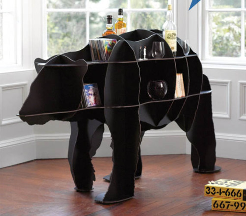
If you've got a bay window that needs a centerpiece take a look at this storage unit. Unfortunately I think they should have made it completely white if they're calling it a "Polar Bear", in my opinion. Nonethleess, it's a cool design. It's also a little pricy... perhaps there's an easy way to build your own. Buy your own here.

Refreshed design: www.alexbuga.com

I posted a blog about Alex Buga's website a couple months ago with a video that showed all the sweet jquery transitions. HIs new site is quite an experience... It's impressive that this is done without flash. Here are some screenshots of his new site.


Beautiful portfolio by www.mediocore.cz

I love how this portfolio showcases work. Bravo. I really enjoyed how simple the gallery was. Often times we try to make our portfolio too clever for its own good. Make your work the star of the show.


District5 creative panel summary.

I had the opportunity to speak on the District5 Creative Panel along with some other wonderful designers and entrepreneurs this weekend at DCWEEK. The thing that really impressed me is that all the panelists started somewhere else in their career (like law, architecture, or graphic design), and then ended up in an entirely different direction.


I felt that I could have answered one question better—we were asked "What does creativity mean to you?". I answered that in the applied arts sense, it means to identify and solve problems based off observation. But what I failed to mention was that I feel that creativity comes from our limitations... such as time, resources, etc. Limitations makes us more creative. It forces us to think outside the box. As designers, it makes us focus on what matters most.


Special thanks to Justin, Emily, and Nafisa. Also thanks to some of my friends (Alyssa, Jim, Hooman) for showing love.

Here's a bonus photo and interesting fact—Emily and Justin graduated from the same college as me. Go RIT Tiiiiigggggerrrsss. Rawr.

midtonedesign.com

Super sexy jquery and icons by midtonedesign.com. I love how it's just so simple. This guy should totally be recruited by Apple. Love the site.


www.studiobreakfast.be

I've come across several design agency portfolios and this one of the better ones I've seen recently. I love how clean and simple it is. The layout is pretty typical, but I like their work, and I like the bits of personality they add. You'll notice at the bottom right corner, they add a cute little "By the way — We love you." I thought that was a nice touch.


Launchlist.net

I love the design of this site. It's a general check list form you fill out before you launch a sight. The gradients and bevels are pretty.


The evolution of the Xbox industrial design.

Xbox just released a new form factor, which pimps a smaller footprint and is coined "slim" as part of its product marketing. I'm not sure if "slim" is the correct adjective to describe it. I thought they could have played off the 360 name... maybe Xbox 720? Anyway, it's got a load of new features, but I want to show the evolution of the exterior body design.


Original XBox
The original Xbox was a tank. It was huge, heavy, and larger than all the other platforms. I detest how they used the ribs on the side to look like a heat sink—it trapped so much dust and crap.


Xbox 360
This was a beautiful and distinct design. It's interesting how the curved shape of the xbox was reflected in their original dashboard interface. The design of the box enabled it to be stood like a tower or flat like a dvd player. Overall, the design was much cleaner, distinct and visually pleasing.


Xbox 360 Elite
As far as form factor goes, it was the same as the Xbox360. The only difference is that it had a black finish and a chrome dvd drive.


Xbox 360 Slim
This is the newest Xbox 360 design, which is smaller and has a more geometric shape (versus the previous organic curvy shape). All the lines converge to the power button, and the gloss black finish gives it a very high-tech gaming machine feel. It reminds me of the Alien Ware desktops—These are computers designed for hard core gamers. I'm sure if I agree with all angles and lines. Personally, I would have preferred if they went a more minimalist rout, and made it look more like a slick super computer server.


Alien Ware Desktop
This is an example of an Alien Ware desktop computer. As you can see, the new Xbox 360 uses some of the same visual language such as gloss black and lines that resemble gills. Both designs also imply that they should be stood vertically.

iPhone request couldn't be processed.

Trying to order the new iphone, but Steve Jobs and AT&T won't take my money. Looks like everyone's melting their server. For days like this, they should give you a number and estimated time until you're served. I believe some sites do this already for music concerts.

By telling people where they are in the process, they will be less likely to keep refreshing and melting their server... and they could get more orders processed. Most importantly, you'd have less disgruntled customers. What do you think?

Jonathan Ive interview, via "Objectified"

I love how Jonathan Ive is so passionate about design. It's just revitalizing to listen to him talk about how every detail matters. If you can't see the video, click here.


My water hyacinth in bloom.

The water hyacinth is considered an exotic plant, but is very invasive. It's actually illegal to transport or sell them in certain states in the US since they have invaded entire lakes. They grow quickly, and can double in population within 2 weeks. Ultimately, their invasiveness causes them to completely deplete the oxygen from the water and kill off all fish and aquatic life.

I have a couple in my fish tank, which I use to help filter nitrates. Here are some photos of their most recent flowers.


Mac Classic with a iPad Touch Screen.

Cool iPad stand. I thought this was pretty clever and fun.


Google Homepage vs Bing.

For a company that prides itself on load time, and removing unnecessary pixels, the Google Homepage now loads a 800x600 pixel image. It loads and animates slow every time I bring up their site. A couple people I respect said they like the new customizable image feature, but I'm not a fan. There's no way to change to site back to the original. If you chance the background to a custom white, the logo is white on white, which is not a great solution.

What would compel Google to roll out something like this? What do you think? Do you like the new feature?

Google


Bing

Dyson engineers with balloons.

These fans are way overpriced, but I love their design. This was an interesting playful test of what they could do with a balloon. When's the last time you had fun designing and playing your own product like this?


Tuesday Music, "Drive It Like You Stole It" by Glitch Mob.

This is my fav song off their new album. If you don't see a youtube video below, click here.


Check out their other song from my other blog post.

Plants vs Zombies, how to beat Survival Endless on iPad.

I was able to beat get the Survival Endless achievement on the iPad this weekend. After a couple weeks of trying and sharing tactics with Dave, we finally figured out a way to beat it. He managed to beat it first and shared some of his winning tactics. Here are some screenshots of what it looks like to get to level 40.


This is what my screen looked like after level 40. I was definitely limping.
Key tactics that you can incorporate:
• Before level 10, you should focus on getting sun and use cat tails
• Before level 20, you should ramp up your fume shrooms and pumpkins
• Before level 30, you should have spike rocks
• After level 30, focus on using ice shrooms, pumpkins, spike rocks, and cherry bombs.

You'll notice that I use a V formation because my outer rows always get hammered by the giant zombies. By offsetting them a couple squares, I have a little more time. you'll also notice that I don't fill every single square. I reserve a couple of empty squares just because it gets too expensive to replace things.

The greatest problems you will have after level 30 will be using more sun than you can produce. Doing enough damage to zombonis and the giant zombies. The fume shrooms should take care of everything else. You'll definitely need ice shrooms and bombs.

Anyone else earn this achievement?

iPhone 4 is faster, sexier, and packs innovation on all fronts.

Since everyone's blogged about it, I'll just say one thing about the new iPhone: I will buy the new one to replace the old Jailbroken Tmobile 2G iPhone.


The combination of innovation on the industrial design, software, and engineering fronts have made this phone the perfect storm.

The most obvious features I'm looking forward to are:
• More battery life
• Faster processor
• Multiprocessing
• Video chat
• New form factor
• Higher resolution screen
• HD Video recording (720P)
• Dual microphone, for better quality phone calls

Westin Heavenly Mattress is truly heavenly (when it's half off!)

Recently I've been having some nasty back pain, and I was considering seeing a therapist about it. Playing volleyball and jiujitsu really has caused soreness in my muscles, but never in my back. I've been thinking about getting a new bed mattress for a while, and I had a chance to swing by Sleepy's with Annie a week or two ago. Since then, I've been doing some research, and decided that I really wanted a Westin Heavenly Mattress. As you may know, Westin prides themselves for their high quality hotels and beds. In fact, their beds are trademarked, and are extremely comfortable. You can order the same model, but it starts at $1400 for queen size. I've tried out other model beds, but I really liked the Westin model... it just felt like a premium experience.

So there's no way I'd pay over $1k for a bed... so I checked on craigslist and found a sweet deal. It looked a little shady, but I contacted the person and he seemed like he had an authentic deal. I was able to get a brand new Westin Heavenly Mattress and box spring delivered to me for less than $640. Tonight will be my first night sleeping on a new mattress, and I can already tell you, it feels great. In fact, I'm lying down, and blogging on it right now... and it's comfy.

My next goal is to accessorize it with some new sheets/pillows/etc.

The Cutting Edge of Extreme Sports Photography, Inspired by Planet Earth

(I've removed the video because it autoplays. Click the link below to watch it. It's worth it!)

Wow, this is bad ass and innovative. It's interesting how the stabilization system used to be weaponized for the military. I can't wait to get a copy of their video. Check out brain farm to learn more.

Check out the original link here.

Original Super Mario Bros, Zelda, Castlevania, Megaman, Metroid, Contra crossover game.

Jay Pavlina creates a crossover game with the original Super Mario Bros. You can play as different characters such as Simon from Castlevania, Link from Zelda, Megaman, Samus from Metroid, and John Rambo from Contra.


As dorky as the creator is, playing and commenting his own game, I have to say he's pretty funny and I was enteretained. I'd love to give this a shot. This cross over is as good as it gets. Hat tip: Vinny

Brown Pelicans vs BP oil spill.

I found these photos here. These photos were shot yesterday, on the beach at East Grand Terre Island along the Louisiana coast.


View Larger Map

oExchange.org Redesign

I worked on redesigning oexchange.org, a spec for sharing links on the web between publishers, sharing tools, and services. The idea was to keep the site design minimal, clean, and make oexchange look like a spec without being boring. I also designed the logo, which is the convergence of many colors into the shape of an "O"... which has potential to be played out in various ways. For example, I had a little fun with the 404 page. Thanks to the team (Will, Charlie, Matt, Foo, Jim, Hoo for making this a cool project).

Homepage


404 Page


I also created a quick Video demo.


Read more about it on Mashable:
http://mashable.com/2010/06/02/oexchange/

Digiday:
http://www.digidaydaily.com/stories/oexchange-protocol-standardizes-web-sharing-tools/

Massive Sink Hole in Guatemala. Real or fake?!

Guatemala gets a sinkhole that takes out half a city block. Is this real or fake? Read more here.


Plants vs Zombies Crochet.

This is totally cool. I want to buy one on etsy. Anyone up for making one? Check out the original zombie connoisseur who created this.