
Concept Design for jimlaneuxd.blogspot.com
I whipped up a quick design for Jim's blog. It'd be slick if the shadows and rounded corners could be styled to take advantage of CSS3. Anyway, here's a layout (literally only took a few minutes)... maybe I'll use this concept for something... hmmmm. heh.
iPad has potential.
While I've heard and read a lot of reviews about the iPad lacking features (like video), it has potential. I feel that it will be a platform for new applications, games, and utilities. The possibilities are endless. If you only look at the iPad for it's literal uses now, it seems very limited, but in the abstract, it will be the new portable device. Laptops will be the new desktops, while the iPad will become the new portable device, like the iPhone.

Here are some ideas for the iPad:
Toolbox
Why carry around a level, floor plans, ruler, instructions, etc... the iPad could carry the largest collection of digital tools, to help you repair and improve your home.
MultiTouch Mouse
Why even use a mouse? Why not use the entire surface of the screen as a multitouch track pad. I know I would use this over a mouse.
External Controller
It'd be cool to use the iPad to control some of the knobs on these pro applications. I'd love to use the iPad as a mixing board for Logic. I could use it in Final Cut as a quick jog tool. It'd be great for games as well. Imagine controlling your favorite game with a multi touch screen.
Games
The most downloaded and used applications on the iPhone are games! This will probably hold true with the iPad. I could imagine new games designed that take advantage of the larger screen. I'd love to play Tap Defense or Tower Madness.
Universal Remote Control
There's already an app for this... so why not create an even cooler one? One that controls everything in your home... like music, tv, etc.

Anyway, there's tons of potential that probably hasn't been realized yet. I agree that the iPad needs a camera, but it can still be a powerful portable tool without one. I imagine that the true power in iPad is not email or web browsing, but rather as a surface that can adapt to many applications. It's a platform for new applications, and for developers to imagine futuristic tools that will make our lives more productive, convenient, and fun.
Here are some ideas for the iPad:
Toolbox
Why carry around a level, floor plans, ruler, instructions, etc... the iPad could carry the largest collection of digital tools, to help you repair and improve your home.
MultiTouch Mouse
Why even use a mouse? Why not use the entire surface of the screen as a multitouch track pad. I know I would use this over a mouse.
External Controller
It'd be cool to use the iPad to control some of the knobs on these pro applications. I'd love to use the iPad as a mixing board for Logic. I could use it in Final Cut as a quick jog tool. It'd be great for games as well. Imagine controlling your favorite game with a multi touch screen.
Games
The most downloaded and used applications on the iPhone are games! This will probably hold true with the iPad. I could imagine new games designed that take advantage of the larger screen. I'd love to play Tap Defense or Tower Madness.
Universal Remote Control
There's already an app for this... so why not create an even cooler one? One that controls everything in your home... like music, tv, etc.
Anyway, there's tons of potential that probably hasn't been realized yet. I agree that the iPad needs a camera, but it can still be a powerful portable tool without one. I imagine that the true power in iPad is not email or web browsing, but rather as a surface that can adapt to many applications. It's a platform for new applications, and for developers to imagine futuristic tools that will make our lives more productive, convenient, and fun.
Website concept sketch for jeffwongdesign.
 I sketched out a couple concepts for an updated portfolio site for jeffwongdesign. I'd like to get some feedback on the visual direction. I'm still working out the navigation, how to showcase the work well, and the general experience... but I wanted to give you a sneak peak and get your thoughts on the conceptual direction.
The images and copy are just place holders—you'll probably notice, I look a little short, and those are not my hands and feet. This is just mock of what the next direction could be. I'll figure out the details later.
My goal was to seem approachable, friendly, and playful. I figured I'd throw it up and get some ideas. Thoughts?
**update** I just tweaked it again... and added a footer that looks more like my style and identity. I think it will work well between identifying my blog and portfolio.
E-mailit.com copies AddThis to the pixel.
One of my coworker's pointed out another AddThis knockoff... and it's pretty shameless—they've copied some of the design elements down to the pixel. It's one of my older designs, so I don't really care... but I wanted to point out that he he literally screen snapped our header and button, and recycled it for his site.
His Header

AddThis Header

His Button (apparently he likes pink... hmmmm...)

AddThis Button

As you can see, I designed this way back in February, 2009.

Anyway, I was flattered. Well, back to work. We've got some innovative things coming soon, so I'm not worried. Hat tip: Foo
**Update**
The website owner of Email-it.com has updated their header, shortly after my blog post. If you click on the comments, you'll notice that he left me a couple of messages expressing how he felt offended by my post, and requested me to remove it. I respectfully declined, but promised to update the post with his updated header. He responded with some kind words, and was diplomatic.

As you can see, his new header looks much cleaner, and I like the design. I'm looking forward to his future designs, as we innovate the sharing space.
His Header
AddThis Header
His Button (apparently he likes pink... hmmmm...)
AddThis Button
As you can see, I designed this way back in February, 2009.
Anyway, I was flattered. Well, back to work. We've got some innovative things coming soon, so I'm not worried. Hat tip: Foo
**Update**
The website owner of Email-it.com has updated their header, shortly after my blog post. If you click on the comments, you'll notice that he left me a couple of messages expressing how he felt offended by my post, and requested me to remove it. I respectfully declined, but promised to update the post with his updated header. He responded with some kind words, and was diplomatic.
As you can see, his new header looks much cleaner, and I like the design. I'm looking forward to his future designs, as we innovate the sharing space.
Whiteboard paint. Goes on any wall.
I'm seriously considering painting one of my rooms with whiteboard paint. I just wonder how hard it is to cover it with another coat of color if I ever change my mind... heheh. Check out the site here.


You dropped food on the floor. Do you eat it?
Notice how bacon has its own decision point. Check out the original link here. Hat tip: Philip (PS. Anytone know what the hand written font is?)

Old jeffwongdesign Resumé (from 2007)
I was dusting off some old work, and I found my old resume from 2.5 years ago. It reminds me of how important it is to keep things simple. There's an old saying, "simplicity means sacrifice". I remember at the time that I wanted to include a ton of other information, but most people would probably judge me on the way my resumé looked, versus what it actually really said. At the time, I thought it I compressed it into one page, it would impress more... and it worked! Anyway, I thought I'd share an old jeffwongdesign with you. Enjoy!


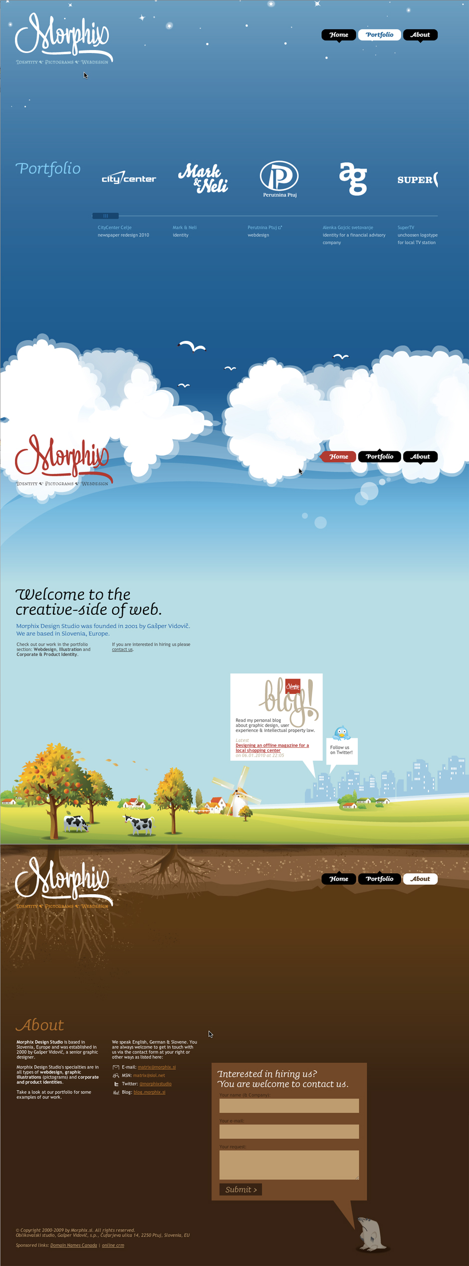
Lovely illustration and site. (www.morphix.si)
This is one of the coolest sites I've seen in a while. I love their header and footer. I'm sure the file size of the background image is huge, but it's nice to see over-the-top stuff from time to time. Love the illustration. I'm going to have to mock up a layout like this sometime soon. Heh. Check out: http://www.morphix.si/
Hat tip: Foo
Hat tip: Foo
Playing with CSS
Just going through a CSS 101 crash course here: http://www.cssbasics.com/. Obviously I know how to hack my way around CSS with firebug, but I wanted to get a better understanding of it by developing something from scratch. Here's what I was playing with this evening...


Sexy Wine. Tastes as good as it looks?
www.blackestate.co.nz is one of the sexiest sites I've come across in a while. I love how the typography and attention to details. Check out the last image of the footer—I love the map at the bototom. I may have to order a bottle from them. I wonder if it tastes as good as it looks.


How to start a fire with a coke can and chocolate.
I've been watching way too much SurvivorMan... but I learned a really cool trick. With a simple piece of chocolate and can, you can start fire. Watch the video.
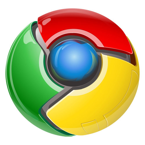
2012 Google Chrome Logo
I've been using Chrome as my main browser recently... it's a fast browser and I love it. But for some reason, I always feel as though I'm being watched. I can't put my finger on it, but the chrome logo freaks me out... it reminds me a little of the "oracle" in Halo 3, or an eyeball from the Terminator.
Anyway, if the world is going to end by 2012 (heheh), it'll because SkyNet... oops, I mean Google will become self aware.

And here's a close up folks...

Anyway, if the world is going to end by 2012 (heheh), it'll because SkyNet... oops, I mean Google will become self aware.
And here's a close up folks...

My Mini Koi Aquarium

Currently, the aquarium is sitting on my kitchen countertop. When I get a larger tank, it may have to move somewhere else.

This is Ichi, about 3.5". He's a gift from my dad.

This is Ichi from the other side.

This is Ni, a gift from Mikio.

And this is San, another gift from Mikio.
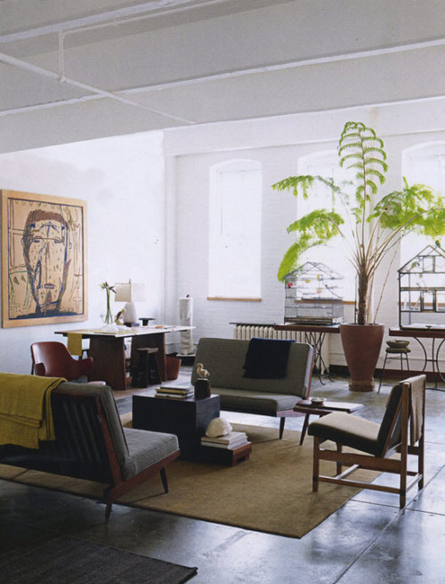
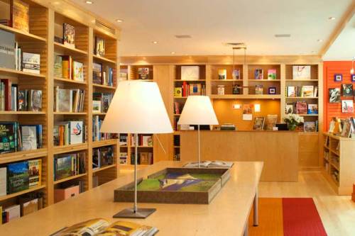
Condo Porn
Some more condo porn I've picked up off the web. Check out my other blog for more pics: http://condoporn.tumblr.com
New Jeffwongdesign Blog Concept
I was playing around this evening with a new blog template concept... I'm thinking about going really large... like 24pt body type, and one large column that scrolls (with about 5-10 posts). I've moved all my sidebar content to a large footer.

 Somehow I'd like to get an illustration of a dog peeing on a fire hydrant in here somewhere... to add a little humor and personality. Thoughts?
Somehow I'd like to get an illustration of a dog peeing on a fire hydrant in here somewhere... to add a little humor and personality. Thoughts?AddThis Top 10 Services Visualization, in PINK!

 This is the original data I used to create the visualization. When you look at it, Facebook is clearly the dominant service used on AddThis. The most social butterflies are using Facebook, followed by Email. When someone asks how people are sharing on AddThis, this is what it looks like.
My AddThis Favorites: Gmail, Tumblr, Instapaper, Facebook and Twitter
Jim wrote a blog post for AddThis this past friday describing his favorite service with AddThis for Firefox/IE/Chrome. I figure I'd post my personal favorite services. I use a lot more, but these are the ones I use the most.
 Gmail
Gmail
 Tumblr
 Instapaper
 Facebook
 Twitter
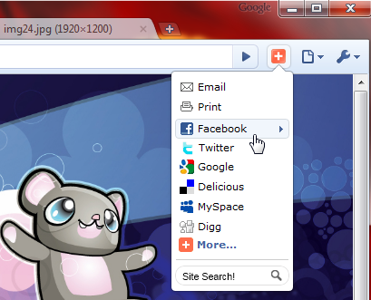 This is what AddThis for Chrome looks like, and it's what I'm using right now. (Nice job Dylan!) I love how it's a nice tight vertical menu.
If you'd like try them out, you can download the plugins here:

Gmail Tumblr Instapaper Facebook TwitterThis is what AddThis for Chrome looks like, and it's what I'm using right now. (Nice job Dylan!) I love how it's a nice tight vertical menu.If you'd like try them out, you can download the plugins here:
 is a journal by


