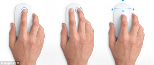
I had to chance to play with the new Apple Magic Mouse this evening with some coworkers (Jim and Justin). I was really excited about it—mostly because it takes advantage of a touch surface, like a track pad. I was really hoping for some cool gestural interactions... but I was really let down.
Let me first mention that my background is in industrial design, and I've designed products like this before. Something like this is really beautiful and sexy, but I must say it wasn't comfortable. I think I'd have to spend alot of time to get use to it. The ergonomics weren't all there.
Honestly, if they just made a giant touch pad (a larger version of their laptop touchpad) as a bluetooth "mouse", I would have been more impressed.
I was really bothered by how low the profile was—I have normal sized hands, and it wasn't easy to hold. It requires you to pinch the sides of the mouse, and float your index and middle finder above the touch surface. If I'm infront of a computer for 8 hours a day, I'm not sure this is going to be comfortable.
Secondly, the only thing that indicates its orientation is the logo. So, you really don't know which way is top or bottom... both my coworkers held the mouse upside-down. Come on Jonathan Ivy, how did this get your signature?

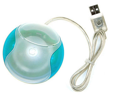
Remember the old hockey puck design? This feels a little bit like it. I mean seriously, do you want all your users to develop carpel tunnel syndrome?
Yes, this mouse should go in MoMa. It's that beautiful. But beauty isn't everything. I mean, for $70 you've got to give us a better design.

The most frustrating part about the mouse is that you can't program advanced gestures. I use spaces... wouldn't it be nice to really take advantage of that touch surface? I'd love to swipe my mouse and move around from space to space. Give me something to work with...
I'm now compelled to design my own version of a new apple mouse...
Stay tuned...
 is a journal by


No comments:
Post a Comment