 AddThis just released a share counter not long ago, that aggregates all shares into a single counter. It's the one definitive number on your site that can tell you its social footprint. If someone shares to Facebook, Twitter or any other social network, AddThis can show how many times the page has been engaged with. If you want to learn more about it, read the official AddThis blog. Right now, I just want to highlight some of the design features that you may or may not have noticed. For starters, there are two form factors. On my blog, I've put the vertical version on the left of each post's title. There's another horizontal pill shaped version that works well either beneath the title of each post, and/or can appear at the bottom of your page.
 CSS vs Bitmap
The next thing you may notice is that the entire button is designed in CSS (except for the plus icon). The challenge of designing it with CSS, is that it has to work across all browsers (like IE 6). For IE users, they would get a non-rounded corner version of the buttons, and all other browsers (like Chrome, Firefox, Safari, etc) would get rounded corners.
 Bitmap Sprite
Here's a sprite of what the bitmap would have looked like. As you can see, there are a lot of effects like bevels, gradients, rounded corners, and more... but we wanted to take advantage of CSS3 and keep the file lighter. This sprite is 2.6k, and the CSS version is much smaller, especially because it can get compressed.
 Share Counter on Color Backgrounds
This is what the share counter looks on different backgrounds. Since it's fairly easy to change the color of the share counter with CSS, you can make it look better on all backgrounds.
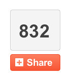
 Scaling with Numbers
As you get more shares across the web, we had to make sure the counter could accomodate even the largest numbers. As you can see, our system works pretty well, and is flexible enough to accomodate millions of shares.
 Font and Colors
To keep things simple, we used Arial as the default font so that it worked well across the web. The hover states were important as well. A little shift in color for the background borderlines makes a nice affordance, to let the user know you can do something.
 Error Handling
Last but not least, here are the error handling states. It's always important to let the user know what's happening. Now, I want to make it clear that we shouldn't have any system failures... but it's always good to have a back up plan in the event there's a minor snag.
So there you have it... these are just some facts about the AddThis Share Counter that I thought were interesting, in terms of design. The most exciting thing is that we've found that sharing is increased with this form factor. I suspect it's because the user gets instant gratification when they share. Give it a try on my blog, or get your own. Huge kudos to the team... especially the guys who worked on the back end. This was quite an endeavor, and I'm excited to be using it.
 is a journal by


1 comment:
1uniquecent.com, Bid and win Penny Auction at the most reliable Online Penny Bidding and Best Online Penny Auction Sites, offering you to Bid and save more as compared to actual market price of the products in Live Auction from USA.
Post a Comment