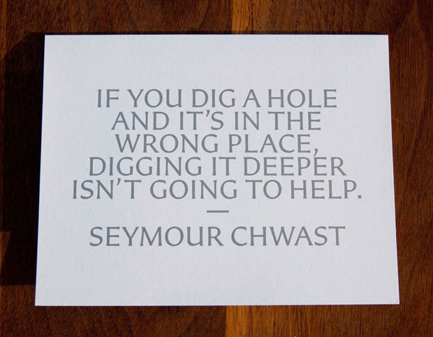
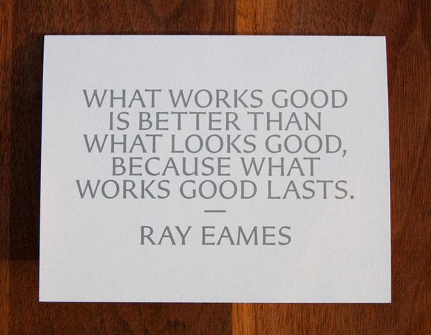
These quotes were used as a part of a promotional piece for the
Art Directors Club Hall of Fame, and originated from some of the most innovative creative thinkers (ranging from photographers, artists, graphic designers, architects, and copywriters). My only criticism is that this design would have looked better flush left. The longer quotes are harder to read, and break funny.


The Carter Sans family is based on epigraphic letters used in inscription, and the gala graphics are suitably elegant and ceremonial. In the campaign materials, the letters A, D and C in all laureates’ names appear in three metallic colors to shimmering, subtle effect. The invitation and other gala materials are wrapped in a paper band that lists the 154 prior Hall of Fame inductees—a piece that pushed the typographic limits by registering four spot colors in 7-point type.
Ps. I love this font—I might have to get my hands on it when it comes out. I get turned on by metallic PMSs... it's been so long since I've done print work. I sure miss designing with PMS-877 (silver) on a nice juicy 120lbs cover stock of Cougar Ultra White. Ohhh la la.
 is a journal by


2 comments:
this is doooope
gotta love good design!
Post a Comment